Home Sale Prices
Home sale prices are a good indicator of gentrification as demand for housing in those areas increase and new developments are constructed. The amenities in these areas are also likely to improve, once again driving up sale prices. For the purpose of this analysis, data from the NYC Department of Finance Data (DOF) was used to analyse sale prices per zip code form 2009-2015. In order to get a proxy for current prices, Craigslist was scraped to home sale price data for 2019.
2009-2015: Home Sale Prices by Borough and Zip Code
Past data was downloaded from the Department of Finance and plotted using Altair, Seaborn, and Holoviews.
Average Price per Square Foot across Boroughs and Years
- The following plot was created using Altair.
- Click on the legend to filter to specific categories of price/sqft!
- Hover over each circle to get more information about the year, price/sqft and borough!
From the above plot, it is clear that houses in the Bronx and Staten Island have a lower price per square foot across all the years. Both prices in Brooklyn and Queens have been increasing from 2009 to 2015, which could be indication of gentrification. Manhattan appears to have a very irregular trend in average price per square foot across the years. The next chart examines the relationship between the price and square feet for each of houses sold in each of the boroughs for the years 2009-2015.
Hexbin Facetgrid comparing Price of Housing to Size for each Borough over Years
- The following plot was created using Seaborn.
- Each individual plot is the Sale Price vs Gross Square Feet of each listing from the data.
- The entire facet grid shows the Boroughs (Rows) vs Years (Columns), and the same color scheme for the Boroughs is followed as from the previous chart.
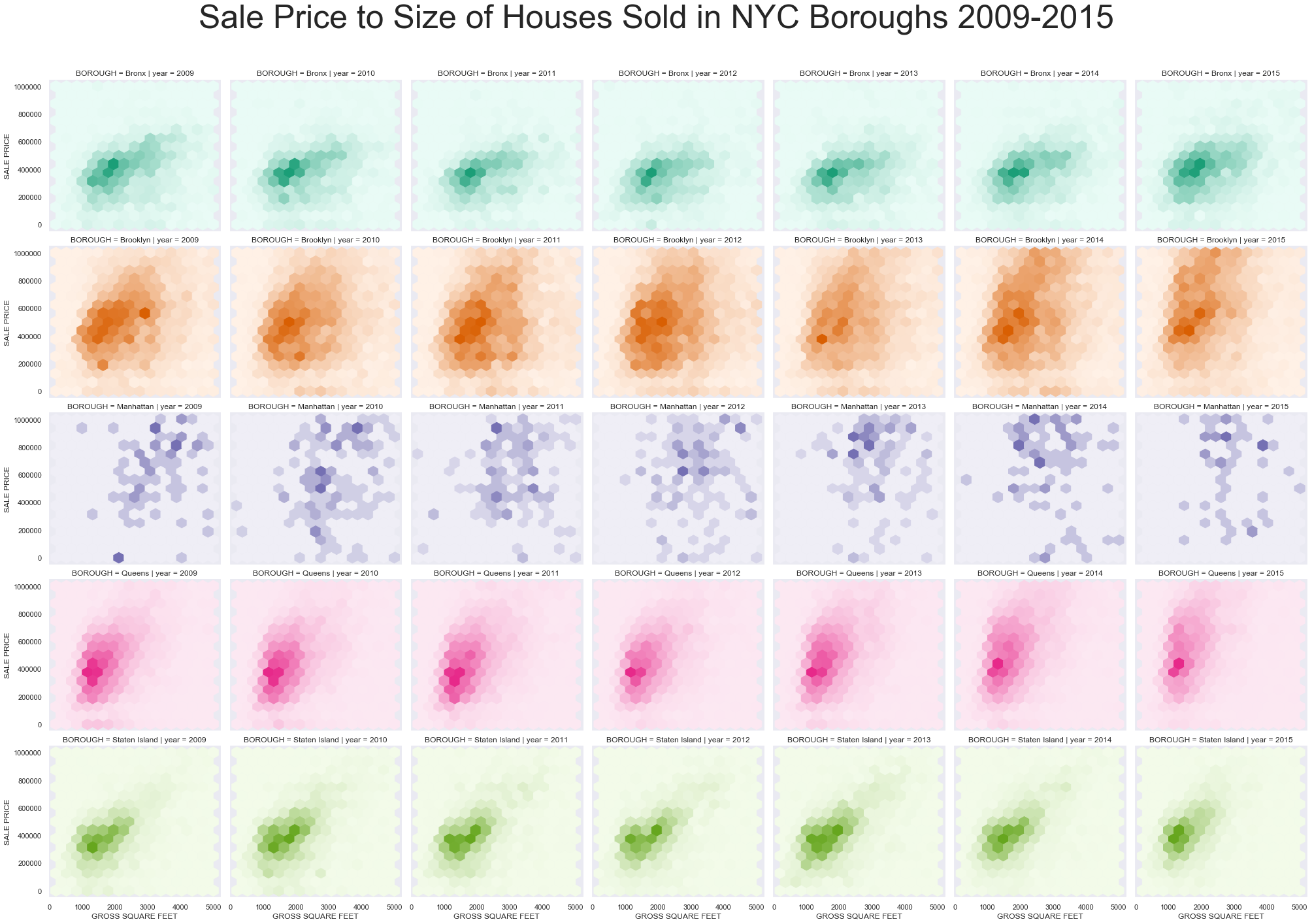
The relationship between the sale price to size is much less steep for the Bronx and Staten Island. In Brooklyn, we notice that over the years, the concentration of price to size becomes progressively streamlined and steeper, indicating that there is an increase in overall sale price per square feet. This could be an indication of rising land value, one of the effects of gentrification. We also notice that Manhattan has a rather wide range of housing price to size, and this could be a reason for the rather fluctuating average price per square foot over the years in the previous chart. Nonetheless, many of the Manhattan observations are clearly on the higher end of the sale price scale.
A Map of Average Price per Square Foot across Zip Codes
- The following plot was created using Holoviews.
- Choose a year in the drop down menu to analyse!
- Roll over the map to get more information about the price per square foot, zip code, borough and year!
To give a spatial context to the distribution of average price per square foot across New York City, a choropleth map was created to identify where there was a clustering of more expensive apartments. Zip codes were used instead of boroughs to provide a more detailed depiction of this distribution across the city, but the borough information can still be accessed via the tooltip.
(You may need to resize the browser screen in order to access the drop down menu to select the year)
There is a clear spatial clustering of high prices in New York City in the Manhattan borough. Throughout the city, prices have also been increasing overall from 2009 to 2015. Zip Code 11201 in Brooklyn (close to the East River) is clearly getting darker over the years relative to its neighboring zip codes, showing an increase in price especially in that zip code in Brooklyn. Prices went up from $503/sqft in 2009 to $1076/sqft in 2015.
2019 Sale Prices: Scraping Craigslist
As current sale prices were not available online, we decided that listings of houses for sale by real estate brokers on Craigslist would be a good proxy for the price of current houses on sale. We thus decided to scrape 600 listings for each of the 5 NYC boroughs and compare the sale price to size for each listing.
Sale Price to Size for each Listing on Craigslist
- The following plot was created using Altair.
- Use the legend to filter the scatterplot to a specific borough!
- Zoom into the scatterplot to examine finer trends!
Any listings that were priced at zero were removed.
2019 listings show that both Manhattan and Brooklyn are more costly at all sizes, and that most of the listings are smaller than the other boroughs. This is consistent with the trend in previous years as well.
Choropleth Map of Average Price per Square Feet per Borough
- The following plot was created using Altair.
- Roll over the boroughs to get the name and average price per square feet of listings in that Borough!
The same trend as in previous the years is observed - Manhattan has the highest average price per square foot, with Brooklyn coming in second. Staten Island has prices slightly lower than Brooklyn. The Bronx and Queens have the lowest average price per square foot.
Conclusion
Manhattan has always been the most expensive borough to live in in NYC from 2009-2019. On the other hand, it is the cheapest to stay in the Bronx and in Queens. There has been a small trend in increasing home sale prices in Brooklyn from 2009 to 2015 relative to the other boroughs. While taking note of this overall trend, it is also important to keep in mind that this is an aggregation of data over the boroughs, and different neighbourhoods within the boroughs could have different trends.